


SUB POP
A Re-branding of the World Famous Indie Record Label
Sub Pop is arguably the most famous and most important record label in indie and alternative music history. Based out of Seattle, Washington, the label started in the late 80s and was instrumental in establishing the sound of that era. Bands like Nirvana, Mudhoney, and Sleater-Kinney are considered to be among the most influential bands of the Alternative Music Scene that was born in the early 90s.
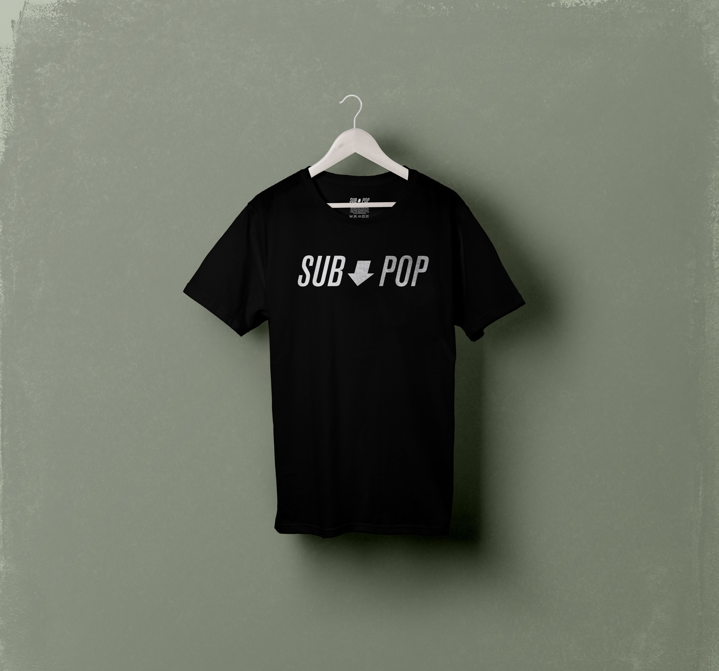
They are still one of the most cutting edge labels today; however, their visual identity has not changed since they began. This is an update to the famous logo and visual brand to unify some of the things Sub Pop has been using over the past couple decades. Sub Pop sticks to their main logo most of the time, but they change it up a lot for things like websites, stickers, and t-shirts, and the visual identity begins to get convoluted. Sub Pop has always used black and white for their color scheme, and it has become an iconic part of their identity, but they invert the colors for the words Sub and Pop, stacking them on top of each other. The updated logo keeps the black and white color scheme, but brings the words onto one line with an arrow separating them. This re-brand intends to unify the classic logo with some of the modern styles they’ve been using to create one cohesive brand.